Showing posts with label Topps. Show all posts

Sunday, November 21, 2021

Monsters Inc

As the days of this blog wind down (more to come on that), I've still got a few things to show off here and there. 

Overall, I think Topps Project 70 is utterly exhausting. Sooz did a good job getting a pulse on these on recent CardChat, and between acts of plagiarism to Topps shutting it down for a few days with little communication, the project was overly ambitious and is now tired.

Therefore, I fully expect a Project 2022 of some sort. This is Topps we're talking about.

The Project 70 checklist has been overloaded with Yankees, Dodgers, Trout, Ohtani. Once in a while a random player is featured, but for the most part it hasn't been as expansive as initially hoped. I thought I might even get a Tino at some point, but it doesn't look like that's going to happen.

And while I appreciate the freedom the artists have to connect their designs to a certain year of Topps cards, many times it's hard to tell and even Topps' website doesn't list the year of correlation. 

I've only bought two so far. I did acquire an early Dock Ellis, and recently, my second arrived:
I do think Alex Pardee has been the star of Topps Project 70. His monster/alien/creature mashups have been a fun change and a lot more creative than some of the other photoshop filter efforts. While they may not be for everyone, after seeing his early Ronald Acuna, I always said that I'd buy any Yankee he decided to contribute.

Obviously, he chose Aaron Judge. The 1972 Topps design remains mainly unchanged, but we've got Judge exhibiting some cool monster-like features. I love the massive Judgian hand come at you. And apparently he's in some sort of bubble bath?

His face looks like it's got a few layers of skin overlapping one another, and he has about a hundred teeth showing. Terrifying, indeed. Pitchers, beware.

My only real regret is not buying this from Topps and even giving myself a chance at a foil parallel. I bought this during en eBay pre-sale to save a few bucks.

Cool card, tired project. That's probably the last one I'll buy...unless we get a Tino somewhere.

Wednesday, August 11, 2021

On demand

'On demand' means a lot in today's world. 

It's become a part of everyday speech, often referring to some sort of instant gratification. To me, it's mostly commonly associated with television. There's even a button on my TV remote with a star on it, with the button's label reading "On demand."

Baseball cards too are now printed on demand, something that started with Topps Now and has evolved into many, many forms of cards released online and printed to order. There are so many of these types of sets now, that it's impossible to keep up. I rarely know what sort of sets are out there at any given time.

It's easy to not pay attention. I have no need to go Topps' website just to browse around. Every so often I'll open one of their emails and notice a set that's currently available on demand. I might even buy one once in a while, such as Derek Jeter-curated set.

Recently on TCDB, someone offered me two Gleyber Torres cards that were printed on demand. I had no idea either card existed.

The first is a 2020 Topps Attax. I don't think the brand every resonated with baseball collectors. I've gotten tons from 2010ish in trade packages. I see the brand seemingly do well for some other sports, like soccer, but in baseball it never made much of a splash. Still, it's neat to see some of today's current players on an Attax design.
The next was a 52-card set created by Kenny Mayne. I love Kenny Mayne. I know there are a lot of cool people who like to brag about not liking ESPN, but Mayne was one of the best SportsCenter anchors and talents to land on air, and his catch phrases and features were always outstanding. While this looks more like a playing card of course, I didn't know this set was even a thing until the card was proposed to me in a swap.
That's all for today. Off to work...where my time is IN demand.

Thursday, April 1, 2021

Beavis and Bretthead

Oh man, Topps Glossy All-Stars. I still remember being at Great American grocery store or Philadelphia Sales or some other drug store, and begging my mom for a cello pack. Three glorious windows of Topps baseball cards, with a a Glossy All-Star in one of the windows. You know, one the looked like this:
It was kind of cool how Topps never really changed up the design on the Glossy All-Stars. Year after year, they were the same. They served a purpose, felt special (at least to a kid), and were a nice reward within the cello packs. It was always fun to dig through the box of packs looking for a Mattingly or Winfield or Henderson.

When one of those guys weren't there, then I would snag someone like George Brett or Wade Boggs or Darryl Strawberry. 

Speaking of childhood memories, it's hard to believe how long ago Beavis and Butthead debuted. I still remember arriving at my cousin's house in Connecticut late on Holy Thursday (which is today, coincidentally) for our yearly Easter trip to visit family. We always left on Thursday night and stayed until Sunday afternoon. And he greeted us at the front door and said to me, "hurry, let's go downstairs. Beavis and Butthead is on."

That was a special occurrence. 

Man, watching that show with an older cousin I admired. Those were the days, sitting in his basement just cracking up.

Huh huh huh huh huh...crack.
What I did not know until recently was that there were Beavis and Butthead cards. In fact, in a recent collection I bought, I found one lonely acetate MTV Beavis and Butthead card. It was one of the coolest, most random cards I unearthed. It actually still sells for a few bucks on eBay, but I'll be keeping this one in my collection.

Oh, and Happy Opening Day!

Saturday, February 20, 2021

I found 2021 Topps (online)

Many of us have been robbed of making that late-night Target or Walmart run when Topps Series One drops, rushing through the parking lot and scurrying to the card aisle in hopes of finding freshly stocked blasters, hanger boxes, and loose packs.

I didn't even attempt it. In fact, my first 2021 Topps cards came via the Trading Card Database, a great place to trade if you like that sort of thing.

However, on Twitter The Bucs Stops Here mentioned that Target had blasters online (and available) for $19.99, so I snagged two, which included free shipping. I beat the bots to them, as they sold out a few minutes later. For the same price as in-store, and much less risk, I was able to open some packs of 2021 Topps. While it might not be the fun experience of physically going to the store and finding cards, I am totally fine with obtaining cards in his fashion.

Although I already had a few in hand, I was excited when these blasters arrived earlier this week.

Here is my first pack-pulled card of 2021.
I don't really have much to say about the design. I'm not going to whine about this looking like Bowman. I like Bowman, so fine by me. Borders make no difference to me either. I think the design itself is perfectly mediocre, like this blog. It will not be my least-liked design of all time, nor will it be among my favorites. If I were ever bored enough to rank the 70 designs, it would probably come in around the mid 40s or low 50s. 

What I do like is that the cards connect! Cool! I don't really use binders, and I don't set collect, but I assume these look pretty fun in a nine pocket page. It's not exactly Fleer Provisions when it comes to connecting, but I still think that's fun.
Carrying on. In a move that surprised everyone, Topps did a lot design reprint cards. The 1952s fell one per pack (I think), which I didn't know until I opened the packs.
While old designs are tired, I do appreciate when they are shiny. And for effect, these also curl like Chrome cards of yesteryear.
Hey everyone, did you know Sy Berger invented the first ever baseball set???
No. Not going here.
Rainbow Foils look nice, per usual.
By far the biggest disappointment for me was these Platinum Players diecut cards. I had high hopes, expecting them to be shiny, perhaps rainbow foilesque. They are the opposite. Flat and dull.
I didn't pull any fancy variations nor did I get a Jo Adell, although I did pull a /99 vintage stock. I won't show it here because it's already in the mail to a blogging buddy. Could it be you?

So there it is. Despite being overall quite meh, it was still nice to keep the tradition alive of opening a few packs. I've spent $40 in worse ways. And if you see anything here you like, let me know. They are already loaded into TCDB, but glad to make a blog swap as well.

Sunday, January 10, 2021

Pay attention and stick to singles, stupid

For the most part, I don't pay much attention to a lot of the custom sets Topps sells exclusively online. These are mostly the Throwback Thursday or other curated sets, whether from athletes, artists, or influencers.

However, my interest was piqued when I saw that Derek Jeter was curating a 52-card set. I got the email, flipped through the checklist, and saw that there were two Tino Martinez cards. For a $19.99 price tag, I was in.

Or so I thought. I clearly just did not read the product description carefully. I thought my $19.99 purchase was giving me a 52-card boxed set.

It wasn't.

It was getting me one 10-card pack of the Topps x Derek Jeter set. ONE PACK!

By the time the realization was made, it was too late. I had clicked purchase. I should have known from the get-go. Outside of maybe a blaster or a hanger, when can you ever get anything like a full set from Topps for $20? I don't know, I just thought I was getting a small set from them. It was honestly a case of just believing what I wanted without clearly reading the description. A stupid mistake, and I was entirely at fault.

I'm not blaming Topps. I'm blaming me. Another sucker.

So I waited, but I wasn't very excited for it to arrive. My silver lining was that maybe I would get an autograph, which fell 1:12 packs. Not too outlandish. That would ease the sting. Or maybe I'd get a low numbered parallel or something. Maybe fate would give me a Tino 1/1 or something. There are cardboard gods, right?

Maybe this mistake would turn into a happy accident! 

It's didn't.

My pack arrived last week, and this was the fruit of my $20.

First, the box is nice. Props for that. I wish the cards looked like that, actually.
Here's how the pack was wrapped. It looked like a mini pop tart.
And here are ALL ten of my cards at two bucks a pop.
Yeah. 

The first card was a David Ortiz, so I was pretty doomed off the bat. No fancy parallel. No autograph. No Tino.

It's not entirely all bad. The two Jeters are cool. Mattingly is cool. Backwards hat Bernie is cool. Sweet Ichiro too. Even the Tim Raines is pretty cool warming up for a game.

But man, for $20? I could have bought something much better. As many around these parts say, stick to singles and buying exactly what you want.

I know better.

I've already picked up the Tino cards for about $2 a piece, and one has already come:
I should have done that from the start. Read carefully, everyone.

Friday, March 20, 2020

Gleyber wil be...32?

I won't lie. I'm sick of the social media joke "Gleyber Torres is 22." Actually, he turned 23 since since last season ended. The joke, like anything on social media, got overdone. Especially when you consider guys like Soto and Acuna have just as bright futures and are younger.

Don't get me wrong, I love Gleyber and hope he's a Yankee for a really long time. A 22-year-old middle infielder who hit 38 homers is pretty awesome, especially when he was projected to maybe hit 20 a year during his prime.

With that, I recently received this 2020 Decade's Next insert from 2020 Topps via a TCDB deal with PhillPhan. I sent him four Phillies cards from 2019/2020 for this one insert card.
I think it's one of the better looking inserts I've seen this year. I still think Topps' inserts are boringly flat, as they refuses to add any interesting textures to the cards. That would = time and money. This would look great with some shine or gold foil or some different texture between the white and black sections of the card. Think mid-90s Ultra.

The back is pretty basic too, but does mention that Gleyber will be 32(!) at the end of the decade. I hope he continues to be productive then, and hope he's still a Yankee at that point. Topps even lists out where he could potentially be at that age stats-wise, such as at 350 homers.
Who knows what could happen between now and then, but overall, one of Topps' better 2020 inserts thus far.

Friday, March 13, 2020

Filler cards are getting better

I'm not someone who gets annoyed when an eBay seller throws in extra filler cards in the packaging.

I once saw someone Twitter complain (shocking, right?) about getting extra cards. Me? Nope. It's fun. Sometimes a seller will send extra Yankee cards, figuring I'm a fan for buying a Yankees card. Sometimes I'll buy a Tino Cardinals card and get Cardinals cards. No big deal.

Recently, I bought a fun Clarke Schmidt die cut autograph:
Cool card. Not much to say. If baseball ever comes back, I hope he stays on his upward trajectory to NY.

The package was also full of filler cards surrounding the purchased card.
It looks like this seller was cutting back on some 2018 Topps inserts.

Pretty cool! I never saw the Postseason Prominence cards. Fairly run of the mill Topps inserts, but a new Jeter I didn't have.

I thought these were cool and a nice gesture. I'll probably add some to TCDB. Or pass them on through a free card Friday.

Regardless, it's cool when a seller throws in something extra, whether it fits my collection or not.

Wednesday, March 4, 2020

Panini could be winning

Over the past few years, I've been really unimpressed with Topps. There have been some exceptions, but as a whole, I feel their designs and card products are pretty lackluster. I know they receive a lot of flack and hating on them is the cool thing to do.

Some of it is warranted. Some is not.

But I just don't think they care about the aesthetics of most of their cards.

As a child of the 90s, I like flashy cards. I like inserts that feel special. Ones that feel rare and nit because they are low-numbered.

Instead, we get things like 150 Years of Baseball that are fairly bland and lack much design thought, and the company just wants to stuff as many subjects into the set as possible.

I miss the 10-card RBI Kings or Wave of the Futures. I miss looking forward to the card that is not like the others in each pack, as opposed to having to squint at the backs of cards looking for microscopic codes to see if I pulled a special card.

Not everyone agrees, and thats fine. One era of collectors prefers a big base set and that's it. Some prefer all the parallels and latest prospects. I prefer a time when inserts were shiny, thoughtful, whacky, and even a bit asymmetrical.

Lately, I've been gravitating towards some of Panini's cards. The logo-less photos are hard to get around. I still don't love it. But their designs can be really interesting. I'm not talking about the weird 2020 emoji cards. I'm talking about Lumberjacks. Like this:
I mentioned on Twitter it looks like a car air freshener. This card could be dangling from the mirror of a cab. It's so cool. And it's even textured. That's what I like. This is something Pacific would have done. They made card ornaments, after all.

Another card that caught my eye was this Prizm. It's an Illumination. That doesn't mean anything to me. I'm not smart enough to know which Panini set is which, but when something like this catches my eye, I try to make it mine. The colorful jewels looks awesome.
I'm not a Panini stan. Not at all. A lot of what they do is awful. And the logo situation is crap. And I rarely see them in stores. And when I do the packs have four cards in them.

But their cards look better than Topps' do right now, and it's not particularly close.


Sunday, February 9, 2020

A positive Series One experience

This past week was the least excited I've ever been for the start of the baseball card season.

I'm not quite sure what it was. Maybe it's the heaps of unsorted cards in my card space. Maybe it's the   uninspiring checklist. Maybe it's the boring inserts. It just felt very ho hum to me, for whatever reason. I wasn't going to boycott or anything. No loud statement. That would be silly. I just wasn't going to go above and beyond to pick some up like I did the past few years.

Two years ago, I got home from work at 8pm or so, got in my car, got to Target only to realize I forgot the gift cards I had set aside. I went back and got them once I confirmed the store had the new supply of cards in. It was a two hour affair. This year, there was zero chance I was going to make that sort of effort.

On Saturday, my son wanted to go to this new comic book store we hadn't tried to look for Pokemon cards (because kids like those more than sports cards). It happened to be on the way to my usual Target. I decided that we'd hit up his store first, then continue on to Target. I even toyed with the possibility of driving to a Target that is further away because they usually have a better stock of cards. But I took the chance on the local one.

Aside from the usual cart of discarded shit in the aisle, I was happy to see a bunch of 2020 blasters, hangers, and loose packs. I won't touch the loose packs at Target. We all know they've been molested by some beast. But the blasters and hangers were well-stocked. Even better, the distributor took away all the unsold ones from 2019, so it wasn't mass chaos.

My son grabbed a box of Pokemon Sword and Shield, and I grabbed one blaster and one hanger, and we were off!

I got home and busted the hanger first. I usually split it down the middle because that's where the goodies are lumped together.

The first card was this guy. Never heard of him. But I do like how his right elbow overlaps the design. That's a fun touch and I like when cards do that.
The second card was this, which is probably my favorite Series One card so far. What a great card of a great player in a great uniform, even if the baby blues are starting to be a bit overdone.
As for the design, I don't mind it. I never do, even when it stinks. I can see why some think it looks like Bowman. But I like Bowman. It shares some characteristics, for sure. I think it's clean, easy to read, and overall looks pretty sharp. Whether or not it's true, it feels like it was done by the same single designer who has done each design since 2016. It definitely shares some very similar elements to 2016, 2018, and 2019. But I'm cool with it. Just another year.

Actually, one complaint. The gloss! Holy moly are these things slippery. I kept thinking that even if I do get one of the Yanks to sign one of these for me, there's no way an autograph would stick. I need to remove a ton of gloss before sending these out for signatures.

Back to the cards. Within the aforementioned middle of the stack, I did indeed get some goodies...and they were Yankees goodies! First, this was facing backwards!
I still like pulling relics, even though this is probably a $3 card if I were to sell it. But I never pull relics of my team, and it's the first time I pulled one from a hanger. Ever. I didn't end up counting the cards, but I assume I got a few less because of it, although it's not super thick.

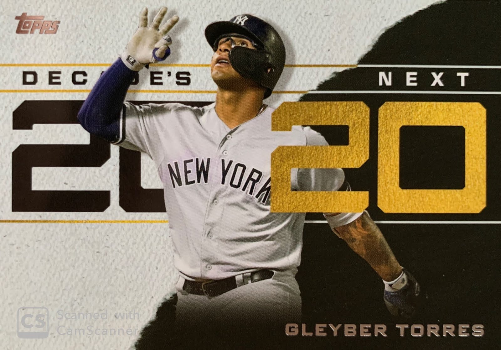
The Sanchez was followed by even more Yankee goodies - a Gleyber Torres Gold, which I was most excited about, and an Aaron Judge Turkey Red.
Side note - Gleyber's card is from a game against Baltimore, which means he was hitting a homer in the photo. But remember, his stats against Baltimore don't count.

As for the Turkey Reds, I like them! I've always liked Turkeys. I like Turkey Red cards more than actual turkey (Thanksgiving meal is overrated). I feel like this isn't the strongest Turkey Red effort, as the mid 2000s versions used a fun texture, while these are flat. So I can't get as totally on board here as I'd like, but the cards look really good and the photos against the background are great.

They've been a TTM favorite of mine for a long time.
The Chrome Turkeys are pretty nice, but they are a bit bendy. I bet the colored refractors are very pretty.
I don't know what to think about the "Best Of" cards. I like the 1950s and 1990s designs, I suppose. At the least the lower third of the card. But I think the concept for the set stinks. I'm very sick of these huge insert sets and just wedging all the legends into them. Same thing year after year. Give me a 10 card RBI Machine or Slick Gloves or something. What happened to the Fleer Ultra 10-card insert sets where they didn't look just like a modified base cards? I guess it's because I grew up in a time where inserts were special and were different and you looked forward to them, but it's very apparent Topps just doesn't care about them. The designers who make digital Bunt cards use some sweet designs. Let's call in those guys for a few insert sets.
And it wouldn't be Series One without old designs!
The Trout was a blue SP (these aren't serially numbered). Great guy to pull, although the card was damaged with a peeling corner and some weird smudge on it? Maybe Topps will replace it?

The Vlad Jr Highlight cards aren't too bad compared to recent player highlight series. I like the nod to 1953 in there. Much happier he was the Target guy versus Hoskins.
Glad to see these back. I've never won one, but I like them. It's gambling, you know. It's a prop bet on if a guy will hit a homer. Gambling on sports is fun. Tell your state to get with it and legalize online gambling (not applicable to those of you who live in NJ, PA, WV, IN, NH, and soon CO).
I did score two SP photo variations as well. The first I didn't notice until going back through after. This came from the hanger as well:
Nice! Very open to trading this for a Gleyber of similar stature.

The second was the very first card in one of my blaster packs. I didn't know it existed until Friday night, so I thought it was funny that I snagged it. Gerrit Cole is a Yankee!
And my Manu-thingie was a good one too! I thought these were kind of dumb when I saw them on Twitter, but I don't dislike them. The medallion isn't too obnoxious. And Ichiro is pretty awesome. I'll be hanging onto this one until his Cooperstown induction.
So there it is. Pretty good for one blaster and a hanger! It's about what you expect from Topps Series One. I had a good experience with it. It helped that I had some good luck with Yankees, had some decent pulls, and found the product on my first try. I won't be buying any more of it, but everything has been loaded into the TCDB and hopefully I can snag some of the Yanks I'm missing.

Let the card season begin!

Tuesday, January 7, 2020

Sacrificing quality for speed

A couple weeks ago, one of the latest Topps OnDemand sets issued three new cards for their 150 Years of Baseball set. From what I can tell, they issue three of these at a time. Collectors can buy them individually from Topps, or as a bundle.

Not wanting to buy all three, I turned to trusted eBay for a seller who was pre-selling one of these cards. I purchased one for under $5 shipped, and then waiting another two weeks for the card to arrive.

Once it did, I was very underwhelmed. 

I know that from some of these OnDemand issues I've previously gotten, the cards tend to not be the greatest quality. Look no further than Topps Total. But I couldn't believe how bad this particular card was.

The photo, taken from the 1998 World Series and used on several Topps cards, was blurry and of poor quality. The entire card felt cheap to me. Something I'd expect from a non-licensed company or app where one might make his own custom trading cards. In that instance, I'd get it. But from Topps? I expect more.

I expect sharper photos and better printing. I expect a sturdier feeling card. I expect something that doesn't feel like I just grabbed it from my HP2600 series printer.

I know that Topps likes to turn these around quickly, but I'm sure I'm not alone in being willing to wait a few days longer if it meant a better end product.

I was happy to see Tino as part of this set, and with the final print run being 686, I am glad to add it to my collection. But I can't say it'll go down as one of my favorite cards of his.

Thursday, December 26, 2019

Cleveland rocks..and so do these cards

Last month, Bru of his self-titled blog decided to purchase one of the 2019 MLB All-Star Game stamped Topps factory sets. Only wanting his own team, he offered up team sets at a very generous price, and I snagged the Yanks.

It wasn't something I needed, but thought it'd be cool to have and keep the set intact.

The set looks the same as a base Topps card, but with a foil ASG logo on it. I have fond memories of Cleveland hosting the All-Star Game. In 1997 at Jacobs Field, Tino won the HR Derby and made the start at 1B. 22 years later, the Midsummer Classic was once again the home for the game.

Here's what the cards looked like:
I wish the main Cleveland ASG logo was used on these, as I thought it was really good. Better than how the NBA has gone to a templated system. The space was probably too small.
Image result for cleveland mlb all-star game logo
Bru also sent some extras, including cards that confused me at first. Turns out, these are 2019 Topps Stickers. And even more confusing, there are card backs that are also cards. I don't know. This is something that the 1990s would have done.
Confusion aside, I thought the sticker designs were really nice, and appreciate that they are standard card size versus the tiny ones. I hadn't seen these at all, so really appreciate Bru sending them along!