In just 9 days, former Yankees infielder Brian Doyle was kind enough to sign my card and return it.
Doyle played for the Yankees from 1978-1980, before finishing his career in Oakland. He hit just .161 in his big league career, with all of one HR. However, filling in for an injured Willie Randolph in the '78 World Series, Doyle found his stroke and hit .438 with 7 hits and 2 RBIs in the series. He had 10 hits and 0 RBIs all season! Didn't plan for that, did you, Dodgers?
Post-baseball, Doyle has been through a lot. Over 20 years ago, he fought and beat leukemia after a grim diagnosis. Then, just last year, he was diagnosed with Parkinson's. That he was still kind enough to take the time to answer a fan letter means a lot to me.
Thank you, Mr. Doyle. You will remain in my thoughts.
I collected baseball cards from the late '80s through 2002. Then I went to college and when I came out, I was lost. There were too many brands, sets, choices, relics, autos, parallels, variations. It was a turn off. However, I slowly made my way back. So here is my attempt to venture back into the hobby. I'll buy a few packs of cards here and there, comment on some cards I have, send out some TTMs, and follow the progress of my Topps Yankees Project.
Thursday, February 11, 2016
Wednesday, February 10, 2016
TTM Success: Ian Clarkin
Yankees lefty Ian Clarkin signed two cards for me, and tossed in an extra of his own. Sadly, I am not certain when I sent this. You see, I lost all my TTM records from 2011-2015 on my previous work computer. Stupidly I had kept my spreadsheet there instead of a cloud or drive I could access, and when I left the company, I massively dropped the ball and forgot to bring a copy.
I was really bummed when I realized what I did. The spreadsheet had who I sent to, what I sent, where I sent to, the number of cards, success/failure, and any notes. It was a lot of info to lose. Total screw up on my part.
I've got a new spreadsheet going on Google Docs, so I'll always have it. There's nothing I can do about all the lost info, except ensure that I don't do it again moving forward.
Long story short, I'm not sure when I sent this Clarkin. I know that I definitely didn't include the Bowman All-American Classic, so I thank Ian for that. The Bowman Ice looks awesome signed as well!
I was really bummed when I realized what I did. The spreadsheet had who I sent to, what I sent, where I sent to, the number of cards, success/failure, and any notes. It was a lot of info to lose. Total screw up on my part.
I've got a new spreadsheet going on Google Docs, so I'll always have it. There's nothing I can do about all the lost info, except ensure that I don't do it again moving forward.
Long story short, I'm not sure when I sent this Clarkin. I know that I definitely didn't include the Bowman All-American Classic, so I thank Ian for that. The Bowman Ice looks awesome signed as well!
I know Eric Jagielo was a great signer with the Yankees. He's with the Reds now, so maybe I'll try to complete the duo.
Thanks for the return. Mr. Clarkin! Best of luck this season.Tuesday, February 9, 2016
2016 Topps - one week later
On Saturday, I carved out a little bit of time to head to
Target and finally snag some 2016 Topps Series One.
I was happy to see the cardboard aisle fully stocked when I
got there. While still disorganized, I was able to find a ton of blasters, hanger
boxes, jumbo packs, and individual packs.
As I was contemplating what to get, my wife called me and
said that my daughter was throwing up everywhere and to hurry up and get home.
Also, get more paper towels. I had intended on really weighing my
options and making a calculated purchase. Instead, I was rushed into my
purchase by a barfing toddler. Parenting!
I’ll also note that I had a $20 giftcard, which would cover
my blaster. I then opted to get an additional 72-card hanger and a 36-card
jumbo pack. It’s kind of silly to spend $20 on a blaster and get 101 cards, and for
the same amount of money I could have gotten 144 cards had I bought two hanger
boxes. However, in the past I’ve noticed bad collation with the hangers, and I
didn’t want to risk too many duplicates. Plus, the big 72 card brick just isn’t very fun to open. I find it stressful. Topps chucks the inserts in the middle,
and it’s just hard to take in all the base cards at once with such a thick
stack. So in the spirit of wanting to open packs, a blaster it is.
I opened the 36-card jumbo pack first, then the hanger, then
the blaster.
First card of the year? Blah.
I will use this chance to say that I really like the base design.
They are different, and who knows if they’ll stick out like a sore thumb in the
grand scheme of Topps designs, but I like the change. I have zero issues with
these looking like TV graphics. TV graphic packages are often far more
technologically advanced than print or digital graphics, so why not? Plus, TV plays a
massive part of the game. Huge rights deals from Fox, ESPN, and local RSN’s are
the reasons payroll and player salaries are soaring (not to mention owners' pockets). TV is good for the game.
My cards can reflect that. Plus, it's just for a year. I'll be curious to see if Topps keeps expanding going in this direction, or if we'll see a more traditional design next year. Regardless, it's one year and not everyone is going to like it. That's life.
I don’t mind the cut-off team logo either. I know what the
logo looks like. It’s on the back too. The smoke is a bit excessive, and the
Instagram-like filters on some of the players make them feel a bit too cartoony. As
for full-bleed photography and name presentation, I think it’s solid though. I like that the player name lacks foil as well.
I got several Yanks, which I was pleased with. I have a team set on the way, but nice to have a few dupes for TTM purposes. I am not a set collector so it won’t bother me beyond an
observation, but those light gray card numbers on the back are bad. I’m curious
if that was something that was missed during the design approval process, or
simply not considered. Who knows?
As for Topps Gold, I like them more than I thought I would.
The player name is a little hard to read, but I actually like the design quite
a bit. With that being said, I don’t understand the rainbow foil parallels. I
know there is usually an additional parallel beyond the Gold, but these are
just a bit boring to me. Also, those two Jayson Werth cards were literally back-to-back in a pack. That hurt.
Now for the inserts. Growing up, I loved inserts. It felt so
special to get one, even when they came one per pack. Now, I don’t really care.
I don’t know if it’s because I’m older or the insert craze has worn off, but I
just find myself flipping past the insert with quite a bit of indifference. I
remember buying Fleer Ultra basketball cards growing up, and when I’d pull a Jordan insert
I’d be on cloud nine. Now I can pull a Trout insert and just not care. That's sad.
As for the individual sets:
Back to Back are fine. Good concept. The designs are ok. Very Pixels-esque. I saw one card where the guys didn't actually go back to back. Come on.
I really like the concept of Pressed Into Service. I would have
liked to see the pitching line on the back, although usually it’s not pretty, but that's the fun. I
guess making the players not look foolish is a priority for Topps, and I don’t
blame them. I'm sure the Player's Association wouldn't appreciate that. On another note, it also just sort of seems like an Opening Day insert set, right?
MLD Debut. Ho hum. Looks very much like the First HR inserts
from last year. There are obviously different colors based on the product you buy. I also noticed the foil printing is all over the place. You can see Babe's name is toward the bottom of the banner, while Cano's is floating toward the top.
Berger’s Best. Dumb. Tired of reprints and having to check
the back of the card to see from which year.
Amazing Milestones. Amazingly boring. There's basically an iteration of this set every year, right? Babe hit 714 HRs. Got it.
Walk-off whatever it is…I don’t understand the design. It
looks like a 2014 Update Power Players design a little bit.
First Pitch. No issues with this set. I like commemorating last season's first pitches and whatnot. I was surprised how much the gold foul logo stuck out. What a sweet old lady. I hope she reached the plate.
Wrigley set - cool. Not for me, but no issues. They look nice.
That brings me to Perspectives. Honestly, I was expecting more. Womp womp womp, I know. It feels like poor man’s Stadium Club with cheap graphics. I thought the player name and “Perspectives” word mark would be more intricately designed, but up close, I’m not impressed. I feel like it could have been done much better with a bit more time and effort.
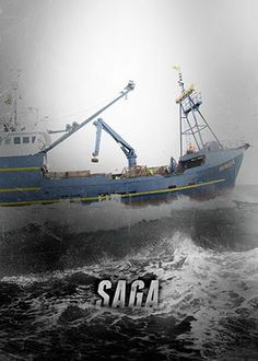
Sticking with the TV-graphics theme, this really isn’t a new concept. Deadliest Catch promos have been doing this sort of effect for years. I can't say I've ever watched the show, I just remember the effects in the promos. I notice these sorts of things as a marketer.
To be fair, I do like the concept and appreciate Topps really issuing a different insert set that breaks the mold from their normal look and feel. I really do. I just felt like these were built up so much that perhaps I had an unreasonable expectation when I saw them in person. I applaud the concept though, and I'm glad that so many collectors have enjoyed it. Hopefully Topps notices and continues to take chances on new, exciting insert sets.
Wrigley set - cool. Not for me, but no issues. They look nice.
That brings me to Perspectives. Honestly, I was expecting more. Womp womp womp, I know. It feels like poor man’s Stadium Club with cheap graphics. I thought the player name and “Perspectives” word mark would be more intricately designed, but up close, I’m not impressed. I feel like it could have been done much better with a bit more time and effort.
Sticking with the TV-graphics theme, this really isn’t a new concept. Deadliest Catch promos have been doing this sort of effect for years. I can't say I've ever watched the show, I just remember the effects in the promos. I notice these sorts of things as a marketer.
To be fair, I do like the concept and appreciate Topps really issuing a different insert set that breaks the mold from their normal look and feel. I really do. I just felt like these were built up so much that perhaps I had an unreasonable expectation when I saw them in person. I applaud the concept though, and I'm glad that so many collectors have enjoyed it. Hopefully Topps notices and continues to take chances on new, exciting insert sets.
Lastly, the guaranteed manu-relic in my blaster was Bernie Williams! I was
pretty pumped. Looking at the checklist, it’s probably the one I would have
wanted most, so I felt good about pulling it. I've seen a ton of people pulling the Cespedes, so I was expecting that. I would be annoyed if it was my
hit in a box, but when it’s the expected manu-hit in a blaster, I am fine with
it and thrilled I got a Yankee.
So that's my story and I'm sticking to it. In short, I like the base and gold, appreciate the effort on Perspectives, and think the rest of the inserts are a bit lackluster. But I'll gladly be collecting the Yanks base and desperately trying to get one signed for my Topps Yankees Project.
Saturday, February 6, 2016
ITT Tek
My buddy Judson of My Cardboard Habit is always looking out
for me. He recently busted some 2015 Topps Tek, and pulled two cards he thought
I would enjoy. He sent them my way, and he was damn right. I do enjoy them.
The only Tek card I had up to this point was an Al Leiter
auto I splurged on. I didn’t have any base or parallels.
The first card in the toploader was a base card. Just a
little guy named Mr. October:
Very cool. But the next card. The next card was very
unexpected!
That’s a Dellin Betances gold parallel numbered to just 35!
I believe it’s a gold rainbow parallel. Whether or not is has other versions or backgrounds, I have no
idea. What I do know is that it’s a very nice card. It’s definitely one of the
nicest Dellin cards in my collection. Something about a clear cut acetate card
plus gold just makes for a really classy card. Oh, and Dellin is really awesome
too.
Judson, thanks my friend!
Friday, February 5, 2016
Delivered via Owl
In the Harry Potter series, it’s well-known that mail is not
delivered by postmen or even electronically. It’s delivered by owls. I’d like
to think that a fluffy night bird delivered this bubble mailer to my NJ
address. That’s my story and I’m sticking with it.
So what did it entail? Clearly a bunch of Yanks that Night Owl
had a hard time parting with.
And it wasn’t just cards. This teeny tiny Don Mattingly pin
fell out. I have never seen these. They are small! And Mattingly was so young
here. It’s really cool. I feel like I need to put it on my backpack or
something.
I know how much NO loves Mark Teixeira, especially when he
is making the puffy fish face. While he isn’t doing it here, these are two
inserts that were passed along, showing that Greg not only pulls Giants cards
at alarming rates, but he pulls Teixeira parallels far too frequently. Maybe
after his Yankee deal is up, Tex will sign with the Giants, and Greg will pull
Giants card of him. Wouldn’t that be enjoyable for everyone but Greg?
This Cano is fancy. I’ve never seen this edition of Bowman’s
Best. It’s nice, but feels like it should be Topps Tribute or Topps Supreme or something else I can't afford. It’s
not quite fitting of Bowman’s Best, in my opinion. Nice card, just off-brand.
I like this card entirely too much.
I think this is my favorite Topps Opening Day set. I really
like the gray border with blue foil. Maybe because it’s Yankees colors? I just
like that it feels different than the flagship, as opposed to the same exact
card with an Opening Day logo.
Some legends are next! Those are not reprints.
Ok, they are. Lastly, a Jeter from 2015 I didn’t have. I
have an unofficial quest to collect 500 different Jeters. I don’t know what
number I’m at just yet, but it’s pretty high. I hope to know within the next
few weeks when I start to organize a bit more.
Greg, thanks for sending this package via owl post. Hope you saved on shipping.
Thursday, February 4, 2016
Beauty in the Breakdown
Before the holidays, or maybe right after, I don’t
know…Gavin from Baseball Card Breakdown sent an awesome package. He had asked
for my address “just in case” he got the urge to send me something. And
shockingly enough, he got that urge.
I must say that Gavin is easily one of the most creative
card bloggers/collectors out there. He’s always doing new things, whether it’s
sketch cards or cutting up signatures to make cooler cut autos, or seeing what
he can make glow-in-the-dark (hint: everything). Personally, I think it’s a
tragedy that this dude is not employed by a card company. I’m sure there are
some creative designers at Topps (“Umm, I dunno. Let’s just make it in the 1987
design. And we can make it mini. Yeah, that’s it.”), but Gavin is constantly
doing things that would be a welcome addition to the current card offerings out
there. Hopefully that dream materializes one day, but for now, we’re all the
lucky recipients of his creativeness.
I wasn’t sure which was to go with as the first card I show
off, but I have to go with the custom, card #9 in the Cardsphere Heroes set
(Gavin, is there a checklist that I missed?). I was honored to be included in
the set. The card features a shot of Tino Martinez tipping his cap the crowd at
Steinbrenner Field in Tampa. I can’t tell if it was from Tino’s last year in
2005, or if it was a spring training guest appearance. The back is equally
cool, with a nice write-up, notably a mention of my Tino collection! Awesome! I
also love the star hologram cut into the card, as well as the 1/1 marketing in
red pen. Am I adding this to my Tino collection as a unique Tino? You bet I am.
The next fabulous item is sort of a card, but sort of not. It’s from the Topps Vault and is a 2000 Topps MVP Pro Set Photo. Essentially, I believe it’s the proof the designers used before sending this card to print. What a cool item! There is even some markings on the back of the Tino card photo in pen around his birthday and draft info. Fact-checking, maybe?
It also came with a COA. I tip my cap to Topps for keeping these around and selling them later as a unique collectible. I had a ton of mechanicals and proofs from old jobs that eventually got tossed in the trash. This could have easily been the fate of this one (and probably was for years before that).
The next fabulous item is sort of a card, but sort of not. It’s from the Topps Vault and is a 2000 Topps MVP Pro Set Photo. Essentially, I believe it’s the proof the designers used before sending this card to print. What a cool item! There is even some markings on the back of the Tino card photo in pen around his birthday and draft info. Fact-checking, maybe?
It also came with a COA. I tip my cap to Topps for keeping these around and selling them later as a unique collectible. I had a ton of mechanicals and proofs from old jobs that eventually got tossed in the trash. This could have easily been the fate of this one (and probably was for years before that).
I also didn’t have this 1990 ProCards Tino sponsored by KFC.
I thought I did when I saw it, but not this particular one.
In fact, Gavin sent the whole team set. There weren’t too many recognizable names other than Dave Burba, but I did notice this guy:
Yep, that’s Casey Close, the MLB super agent. He was formerly with IMG, CAA, and now runs Excel. He represented Derek Jeter for his entire career, and he still represents Tanaka, Kershaw, and Greinke. Pretty cool.
In fact, Gavin sent the whole team set. There weren’t too many recognizable names other than Dave Burba, but I did notice this guy:
Yep, that’s Casey Close, the MLB super agent. He was formerly with IMG, CAA, and now runs Excel. He represented Derek Jeter for his entire career, and he still represents Tanaka, Kershaw, and Greinke. Pretty cool.
Wednesday, February 3, 2016
A slurpee and a signature
Some 25 years ago (holy rap 1991 was 25 years ago), 7-Eleven used to put out Score-branded player discs/coins. They had a sportflics-like effect on the front, and some stats on the back. I have been aware of the 1991 Score 7-11 Tino for quite a while, and while it's never expensive, I just have never picked it up.
I finally stumbled upon one on eBay with a very low starting bid, and I was the only bidder, so I finally snagged it.
But there's a catch. This wasn't a surprise to me either, but this particular coin is signed on the back.
Now, I have zero clue if this auto is authentic. The signature looks good to me, but who knows. It could be completely forged...or it could be real. I don't know. But I won it for $.99 and needed it anyways, so I figured, why not roll the dice?
Now, I guess I should probably pick up a clean, unsigned copy of the coin, eh? I suppose I'm right back where I started...
I finally stumbled upon one on eBay with a very low starting bid, and I was the only bidder, so I finally snagged it.
But there's a catch. This wasn't a surprise to me either, but this particular coin is signed on the back.
Now, I have zero clue if this auto is authentic. The signature looks good to me, but who knows. It could be completely forged...or it could be real. I don't know. But I won it for $.99 and needed it anyways, so I figured, why not roll the dice?
Now, I guess I should probably pick up a clean, unsigned copy of the coin, eh? I suppose I'm right back where I started...
Subscribe to:
Posts (Atom)